Beyond the Basics: A Photorealism Drawing Tutorial

You’ve seen them, those AMAZING portraits that make you do a double-take. The portraits that are so rich with detail, texture, and light that you have to ask, “Is that a drawing or a photo?” Generally, there’s a certain magic to hyperrealism, a profound sense of awe in seeing reality so perfectly captured with nothing but a pencil and paper. As a result, you feel that awe, and you want to replicate that effect. However, when you try, that magic feels a million miles away. Instead, your drawings look flat, your shading is blotchy, and the result is more “cartoon” than “capture.” Well, you’re in luck because here’s my photorealism drawing tutorial.
If you’re feeling frustrated, know this: realism isn’t created by accident. On the contrary, it’s a method and series of deliberate, patient steps that, when followed can transform your art from lifeless to unbelievably lifelike. Realistic drawing isn’t about being born with a special “talent.” It’s about having the right roadmap as an artist to create realistic effects. In this article, I’m happy to share my own experience of how to navigate this roadmap. This is your comprehensive, 9-step guide to begin creating the stunningly realistic portraits you’ve always dreamed of.
Step 1: The Foundation – A Flawless Reference and Underdrawing
Hyperrealism begins long before you start shading in the phase of your mental preparation. In other words, the deliberate visual planning of an artist’s roadmap is crucial to achieving realistic results. Without it, you cannot render what you cannot see, and you cannot fix a flawed foundation with pretty details.

Choosing a High-Resolution Reference Photo For A Photorealism Drawing Tutorial
Your reference is your visual blueprint, so choose it wisely. Truthfully, choosing a low-quality, blurry, or poorly lit photo will set you up for failure. Furthermore, select a high-resolution digital reference image that you can zoom into. Also, look for photos with a clear, single light source that displays your subject using a wide range of highlights and shadows. The more detail you can see in the reference, the more realistic affects you can translate into your drawing. Learning how to see and choose this type of quality photo reference takes some time and practice.
Nailing the Underdrawing: The Grid Method for Perfect Accuracy
Creating underdrawings is a step that is non-negotiable for realism. Even the most experienced artists used underdrawings to ensure the preliminary phase of their art was executed as accurate as possible. For example, one of my favorites: Maxfield Parrish. Rest assured, The Grid Method is your best friend in using this photorealism drawing tutorial. Reason being, it provides you with greater drawing accuracy. By drawing a grid over your reference and a corresponding, proportional grid on your paper, you can copy the information within each small square. This bypasses your brain’s tendency to distort features and ensures your proportions are perfect before you invest hours into rendering. “Rendering” is another word to describe shading in the act of drawing.
Step 2: The Value Map – Plan Your Lights and Darks
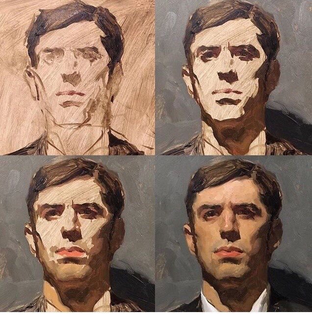
Before you start shading, you need a plan. Firstly, sketch out the major shadow shapes you see in your reference using light-handed strokes. This is your “value map.” Identify the absolute darkest parts of the image (often the pupils, nostrils, or dark crevices) and the brightest highlights (the specular highlight in the eye, highlights on a shiny nose). This simple plan will act as your guide, preventing you from getting lost in the details and maintain a strong, consistent sense of light and shade values. Above, is an example of when artist Sean Cheetham drew his basic shapes (with oil paint) first, then began to flesh-out the details. You can do the same with pencil or charcoal.
Step 3: The First Layer – Building a Smooth Base
To achieve realism through the shading of tones on your drawing surface, you must build up the layers of shade. Most importantly, the first layer of your shading will establish a smooth, even base. Avoid rushing this step or else it will lead to a blotchy, uneven texture later on in your drawing. First layers of shade should also depict broad, general shapes of tone. Don’t focus on shading small details yet and instead establish your foundation of value.
Using Hard-Grade Pencils (2H, H) for Initial Tones
Start with a hard-grade pencil, like a 2H or an H. These pencils deposit less graphite and are less likely to indent the paper. Using very light pressure and a sharp point, apply a smooth, even layer of tone across the entire portrait, leaving only the brightest highlights as pure white paper. Don’t press your drawing instrument down hard. Instead, apply your pencil by gently whispering the first layer of value onto the page.
Step 4: Rendering the Form – Gradual Layers and Seamless Blending
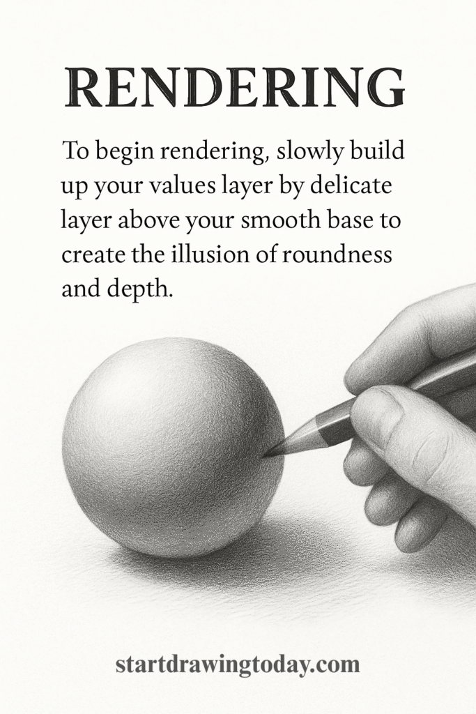
Rendering is where the magic of 3D form begins in learning how to draw realistic faces. I love this phase, as you may be able to see while viewing my drawings. To begin rendering, slowly build up your values layer by delicate layer above your smooth base to create the illusion of roundness and depth.
The Art of Layering with B-Grade Pencils In A Photorealism Drawing Tutorial:
Switch to your softer, darker pencils (HB, 2B, 4B). Continue to use light pressure, building up the darker values in the shadow areas. It’s crucial to be patient and apply subtle darkening of each layer upon the one before it. This gradual process is what creates those seamless, photorealistic transitions of shade.
Blending Tools and Techniques, A Photorealism Drawing Tutorial
To achieve the smooth look of skin, practice techniques for blending your graphite. A blending stump or tortillon is great for small areas, while a soft brush or a tissue can be used for larger, smoother transitions. The key is to blend gently after every few layers to keep the tones smooth and avoid a grainy texture. Whether you use graphite pencil, graphite powder or charcoal, the blending stump is great for depicting realistic shading.
Step 5: The Magic of Texture – Creating Realistic Skin, A Photorealism Drawing Tutorial
Skin is not a perfectly smooth, plastic surface. On the contrary, it has pores, wrinkles, and imperfections. Hence, the depiction of these subtle textures as an artist will elevate your drawing from “good” to “unbelievably real.”
The Indentation Method for Pores and Wrinkles
Here’s a professional-level trick. Firstly, take a tool with a hard, fine point (a dedicated indentation tool, a mechanical pencil with no lead, or even a dead ballpoint pen) and gently press tiny dots or lines into the paper where you see pores or wrinkles. Secondly, when you shade over the area with the side of your pencil, the graphite will skip over the indented marks, leaving them as perfect, subtle highlights.
The “Lifting” Technique with a Kneaded Eraser
In my photorealism drawing tutorial, your eraser is a drawing tool. Shape a kneaded eraser into a very fine point and use it to “lift” tiny bits of graphite off the page. This shaping of your eraser allows you to create subtle highlights and skin texture. It’s an effective method for adding that slight sheen to the skin or defining the texture of lips.
Step 6: The Windows to the Soul – Drawing Lifelike Eyes
In artistic practice, an eye is what brings a portrait to life. Generally, if the eyes look dead, the whole portrait fails. Hence, spend a significant time studying the details, shade and volume for this part of the face. My photorealism drawing tutorial is a great place to start.
It’s Not Just the Iris: Shading the Sclera
A common mistake is leaving the “white” of the eye as pure white paper. In fact, the sclera is a sphere, and it needs to be shaded like one. Moreover, there will be a shadow cast by the upper eyelid, and the eyeball itself will have shading on the sides to make it look round.
The Crucial Role of the Specular Highlight
The final touch that gives an eye its “spark” is the specular highlight—the tiny, sharp reflection of the light source. This should be the brightest white in your entire drawing. You can preserve it by drawing around it or lift it out at the very end with a sharp eraser or even a touch of white gel pen.
Step 7: The Crowning Glory – Rendering Realistic Hair
Hair and it’s complexity is another major frustration for many artists, especially those learning how to draw realistic faces. The secret: avoid being fixated on drawing individual strands and start thinking in terms of large shapes and values. As you gradually go from large shapes to small, always maintain a vision of the bigger shapes and keep comparing the two.
Draw Hair as Shapes, Not Strands In A Photorealism Drawing Tutorial
Squint at your reference. You’ll see that the hair is made up of big, abstract shapes of light, mid-tone, and shadow. Block these big shapes in first. Render the hair as if it were a solid, sculpted object, focusing on the flow and form.
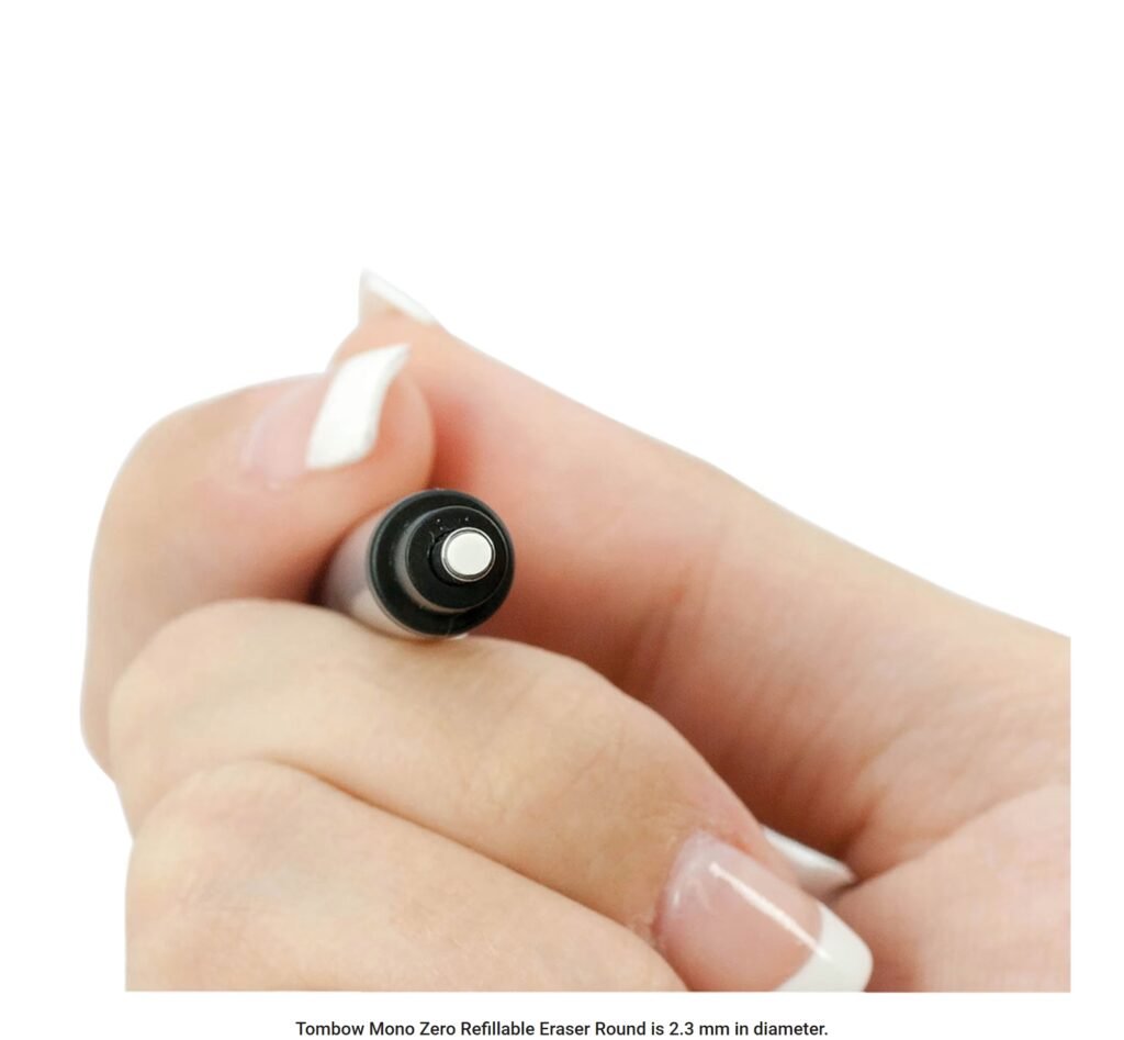
Using an Electric Eraser for Individual Highlighted Strands
Once you have a solid, dark base for the hair, use a fine-tipped eraser (like a Tombow Mono Zero or an electric eraser) to “draw” the highlights. By pulling out individual light strands from the dark mass, you create a stunningly realistic effect that is impossible to achieve by drawing dark lines on a white background. I used to create highlights the hard way: by leaving lighter space in my drawings around my shading. That technique still works to an extent. Surprisingly, I discovered that erasing the highlights later from out of my shading base is easier and produces better results.
Step 8: The Final Polish – Pushing Contrast and Refining Edges
You’re almost there. This final phase is about making your drawing “pop.”
Adding Your Darkest Accents In A Photorealism Drawing Tutorial:
Take your darkest pencil (a 6B or 8B) and go back into the drawing. Gently darken the absolute darkest parts: the pupils, the inside of the nostrils, the corners of the mouth, the deepest cast shadows. This final push in contrast will dramatically increase the sense of depth and realism.
Softening and Hardening Edges for Focus
Use a soft eraser to gently soften the edges of objects in the background (like the shoulders or hair that is further away). Then, make sure the edges around your focal point (usually the eyes) are sharp and well-defined. This manipulation of edges guides the viewer’s eye and enhances the illusion of depth.
Step 9: The Artist’s Mindset – Patience is Your Most Important Tool
Hyperrealism is a marathon, not a sprint. A single, highly detailed portrait can take 20, 40, or even 100+ hours. You cannot rush it. You must learn to love the slow, meditative process of building up layers and rendering details. Put on some music, get comfortable, and enjoy the journey of watching your creation slowly come to life.
Conclusion: A Photorealism Drawing Tutorial
In conclusion, creating a realistic portrait is one of the most satisfying and rewarding experiences an artist can have. It’s a testament to your skill, your patience, and your ability to truly see. By following this 9-step roadmap of my photorealism drawing tutorial, you are no longer just doodling; you are engaging in a methodical, professional process. The path to realism is paved with patience and practice, but it is not a secret path. It is open to anyone willing to walk it.
Choose one of these advanced techniques, like the indentation method for skin texture, and try it on a small section of your next portrait. You’ll be amazed at the difference it makes. Now go and create something that magic. The magic is waiting for you.
Leave a Reply